Case Study Examples

Website Redesign, Branding, Print Materials, UI Design, UX Consultation. Full Case Study
Website Redesign, Branding, Print Materials, UI Design, UX Consultation. Full Case Study

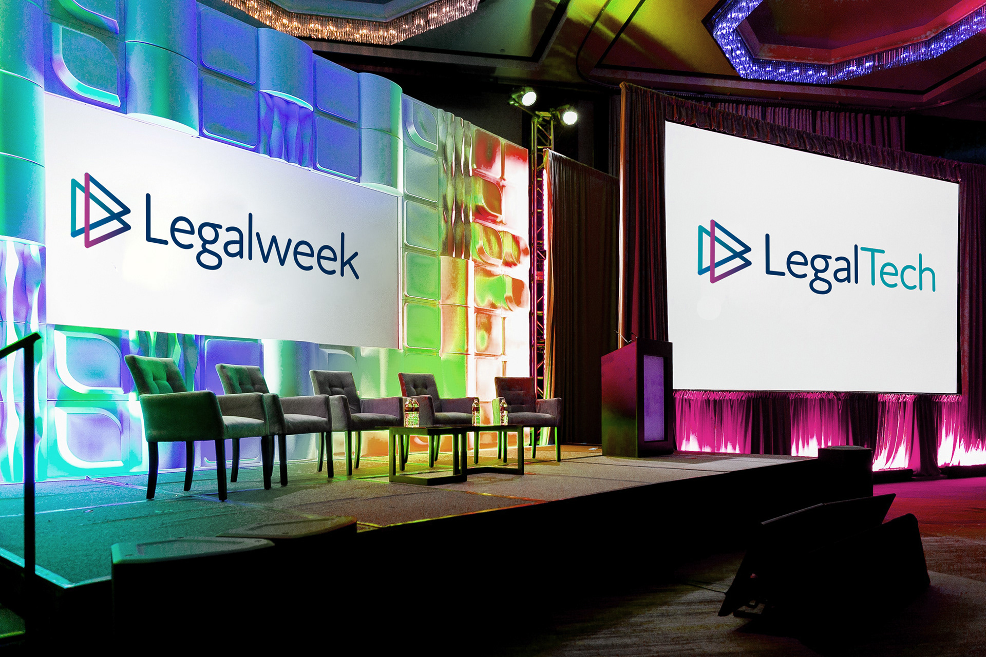
Website Redesign, Branding, UI Design, Mobile Design, UX Consultation, Livery, Microsoft Word. Full Case Study

Livery, Vehicle Graphics, Logo Design, Brand Guidelines, Stationery. Full Case Study
Client Results & Reviews
"30% increase in sales of one of our main products."
Nora Devine, President at Distribution Publications, Inc., Website Redesign, UI Design for SaaS
“...My Followers have doubled in a short amount of time.”
Mike Reeves, Echo2ndHand Music, Logo Design and Banner
"She took any feedback and my ideas about the items on board, made changes quickly and produced fantastic work."
Abbe Smith, MMT Digital, Print Design, Branding Materials
"...Charlotte has been fabulous to work with. I look forward to working with her again and would thoroughly recommend!"
Grace Cleere, Senior Marketing Manager, Pearn Kandola LLP, Presentation Design / Pitch Deck, Website Redesign, UI Design, Branding Consultation